CSS Links are used to navigate from one page to another page or simply it’s a connection between one webpage to another webpage. CSS Links
Different types of links are…
- visited: represents a link that has already been accessed, visited, styled using the: visited pseudo class.
- unvisited link: is the default state in which a link is located, more precisely when it is not in any other state. It can be designed in a specific way using the link pseudo class.
- active: represents a link that is activated by clicking on the link, styled using the: active pseudo class.
- hover: represents a link that, once the user hovers over the link, the property is activated, styled using the: hover pseudo class.
- focus: represents a link that has been focused (example: the user moves the action to a page element using the Tab key or programmatically focused using HTMLElement.focus ()), styled using the: focus pseudo class
a:link {
    /* styles for unvisited links */
}

a:visited {
    /* styles for visited links */
}

a:hover {
    /* styles for links when the mouse is over them */
}

a:active {
    /* styles for links when they are being clicked */
}
In this example, “a” is the selector for all hyperlinks in the HTML document. The pseudo-classes “:link”, “:visited”, “:hover”, and “:active” are used to apply different styles to the links depending on their state.
It is also possible to style specific links by using a class or ID attribute in the HTML and then using a class or ID selector in the CSS. For example, if a link has the class “special” in the HTML:
<a href="fullstackadda.com" class="special">Fullstackadda</a>
You can target that specific link in the CSS using the class selector:
.special {
    /* styles for the link with the "special" class */
}
You can also use the <style> tag in the <head> section of your HTML document to define your CSS styles.
Consider an example: CSS Links
<!DOCTYPE html>
<html>

<head>
    <style>
        p {
            font-size: 30px;
            text-align: center;
        }
    </style>
</head>

<body>
    <p><a href="https://fullstackadda.com">Demo Link</a></p>
</body>

</html>
Output:
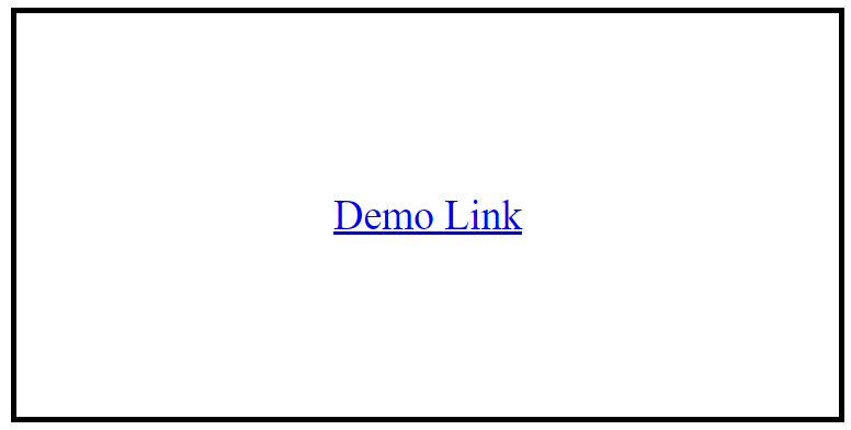
We can style the links in different ways like using text-decoration, background-color property, link to a button.
Example using text-decoration:
<!DOCTYPE html>
<html>

<head>
    <style>
        a {
            font-size: 30px;
            text-align: center;
            text-decoration: none;
        }
    </style>
</head>

<body>
    <p><a href="https://fullstackadda.com">Demo Link</a></p>
</body>

</html>
Output:
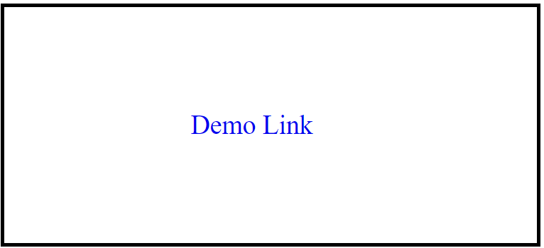
Example using backgroud-color to a link:
<!DOCTYPE html>
<html>

<head>
    <style>
        p {
            font-size: 40px;
            text-align: center;
        }

        a:link {
            background-color: yellow;
        }

        a:visited {
            background-color: green;
        }

        a:hover {
            background-color: lightgreen;
        }

        a:active {
            background-color: lightblue;
        }
    </style>
</head>

<body>
    <p><b><a href="fullstackadda.com" target="_blank">This is a link</a></b></p>
</body>

</html>
Output:
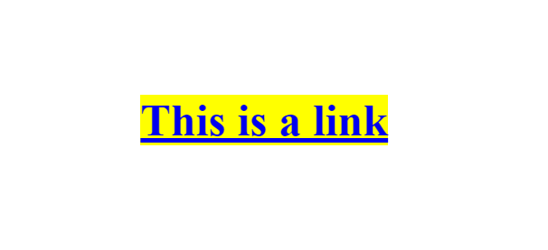
when you hover that link it will change the color
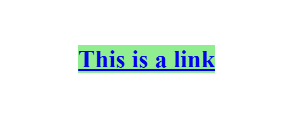
when you click that link it will change into
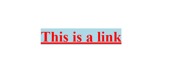
Example button to a link:
<!DOCTYPE html>
<html>

<head>
    <style>
        a:link,
        a:visited {
            background-color: green;
            border: none;
            color: #FFFFFF;
            padding: 25px 60px;
            text-align: center;
            text-decoration: none;
            font-size: 20px;

        }

        a:hover,
        a:active {
            background-color: blue
        }
    </style>
</head>

<body>
    <a href="https://fullstackadda.com" target="_blank">BUTTON</a>
</body>

</html>
Output:

After hover to a button the output will be


- CSS Links are used to navigate from one page to another page or simply it’s a connection between one webpage to another webpage.
