
CSS media queries allow you to apply different CSS styles based on the characteristics of the device rendering the content, such as screen size, screen resolution, and device type. This allows you to create responsive designs that adapt to different devices and screen sizes. Media queries use a media type and one or more expressions that check for the values of various media features, such as width, height, and color. You can use the CSS @media rule to apply a block of CSS styles based on the result of a media query.
There are several types of media queries in CSS:
- Width and Height: These media queries allow you to apply styles based on the width or height of the viewport. For example, you can use the
min-widthormax-widthmedia feature to apply styles to devices with a certain minimum or maximum screen width. - Resolution: These media queries allow you to apply styles based on the resolution of the device. For example, you can use the
min-resolutionormax-resolutionmedia feature to apply styles to devices with a certain minimum or maximum screen resolution. - Orientation: These media queries allow you to apply styles based on the device’s screen orientation. You can use the
orientationmedia feature to apply styles to devices in landscape or portrait mode. - Aspect Ratio: These media queries allow you to apply styles based on the aspect ratio of the device’s screen. You can use the
aspect-ratiomedia feature to apply styles to devices with a certain aspect ratio. - Device Type: These media queries allow you to apply styles based on the type of device. You can use the
mediafeature to apply styles to print, screen, speech, and more. - Update with javascript: using matchMedia() method
These are some of the main types of media queries in CSS. You can use any combination of these media features to create complex and powerful responsive designs that adapt to different devices and screen sizes.
- @media – keyword to initiate a media query
- Media types – defines the type of media we’re trying to target. In most cases, the value `screen` will be used here, but other types are available as well, including `all`, `print`, `screen` and `speech`
- Media features – are the conditions for which media devices need to match in order to apply styles.
- Operators – logical operators that are like `&&` and `||` but for queries, the keywords are ‘and’, ‘,’(for or), and ‘not()’ for not.
Syntax: CSS Media Queries
@media print {
  /* rulesets */
}

@media screen {
  /* rulesets */
}

@media screen, print {
  /* rulesets */
}

@media screen and (min-width: 500px) {
  /* rulesets */
}
Why do we use media queries in CSS?
Media queries are useful when you want to modify your Website or app depending on a device’s general type (such as print vs. screen) or specific characteristics and parameters (such as screen resolution or browser viewport width).
Example:
<!DOCTYPE html>
<html>
<head>
<title>CSS media query</title>
<style>
body {
text-align: center;
}
.div1 {
font-size: 40px;
font-weight: bold;
color: green;
}
@media screen and (max-width:800px) {
body {
text-align: center;
background-color: grey;
}
.div1 {
font-size: 30px;
font-weight: bold;
color: yellow;
}
.div2 {
color: yellow;
}
}
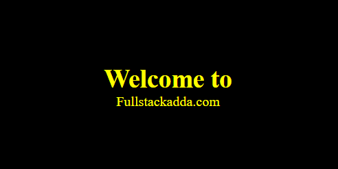
@media screen and (max-width:500px) {
body {
background-color: black;
}
}
</style>
</head>
<body>
<div class="div1">Welcome to</div>
<div class="div2">Fullstackadda.com</div>
</body>
</html>Output:
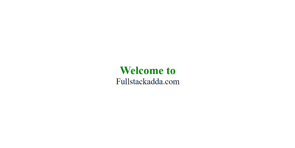
When screen width is 800px
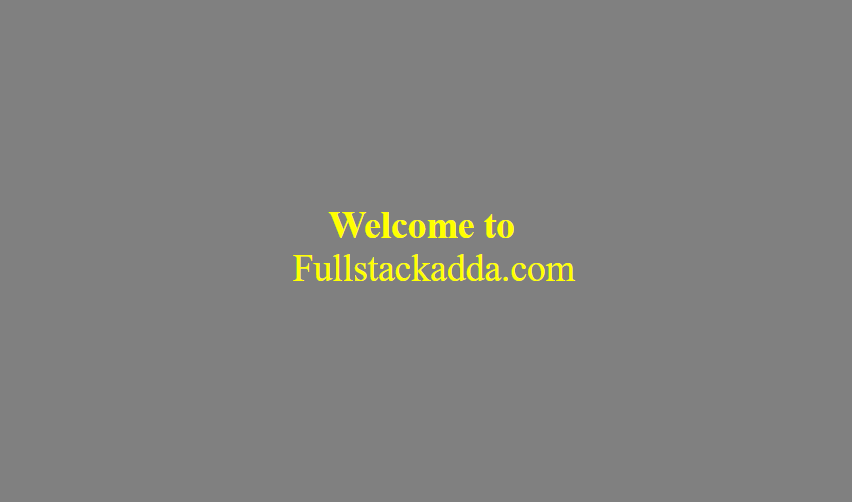
When screen width is 500px
Media Types
| Value | Description |
|---|---|
| all | For all media type devices |
| For printers | |
| screen | For computer screens, tablets, smart-phones etc. |
| speech | For screen-readers that “reads” the page out loud |

- CSS media queries allow you to apply different CSS styles based on the characteristics of the device rendering the content, such as screen size, screen resolution, and device type.
- Some media type are
- all
- screen
- speech